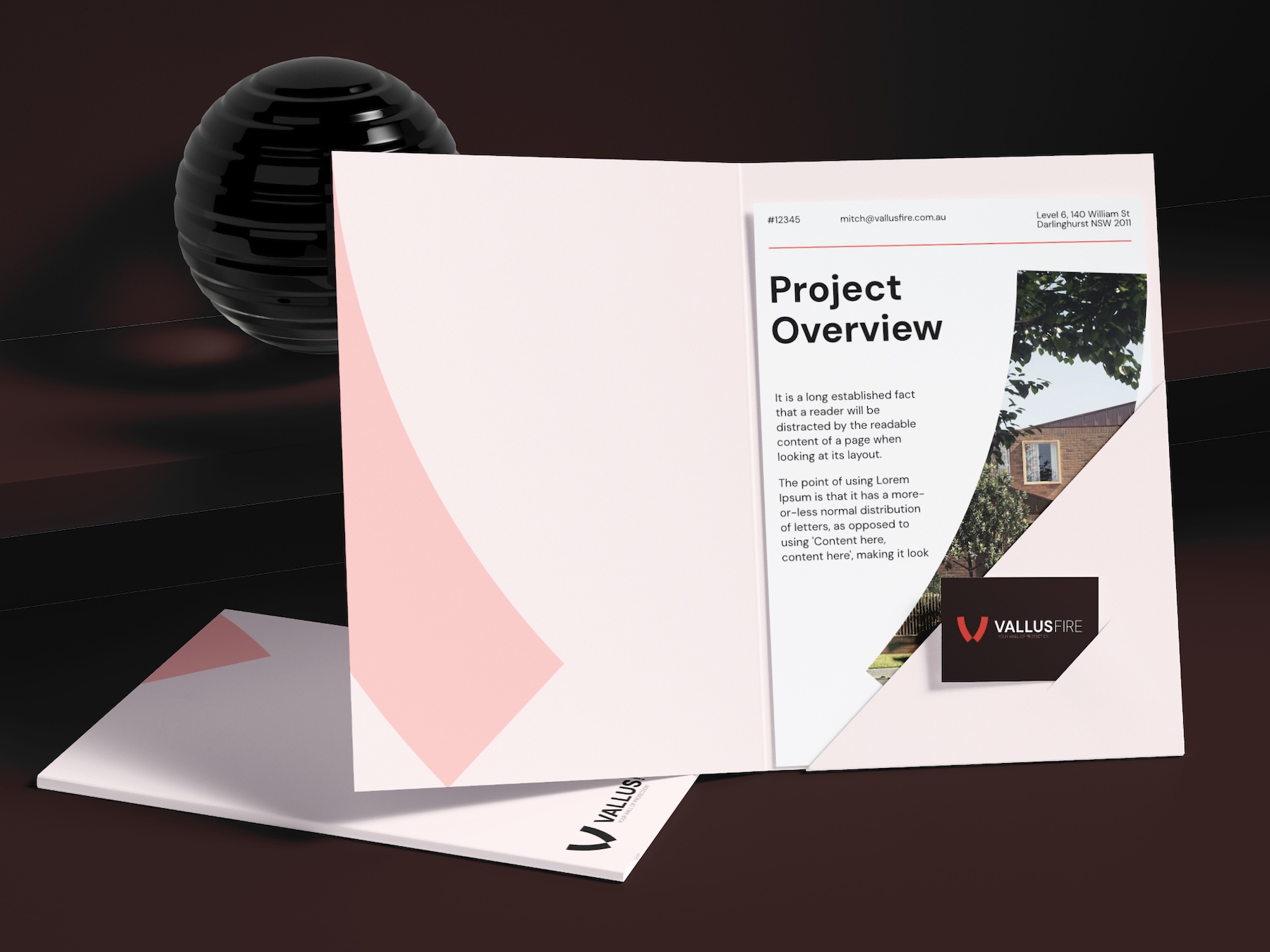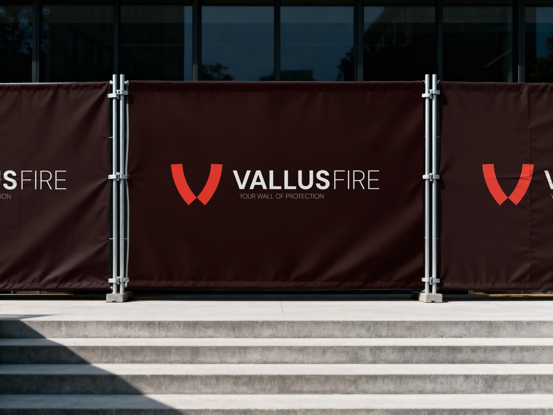
Vallus delivers fire protection systems designed to work in the real world, not just on paper, and a full brand identity needed to communicate that.
Vallus tasked us with the creation of visual and verbal brand that would be cohesive across all touch points, however this brand had to submit to a number of industry cues to signal trust and experience. The challenge was communicating the brand's uncomplicated ways of working without being too expected, or too abstract.
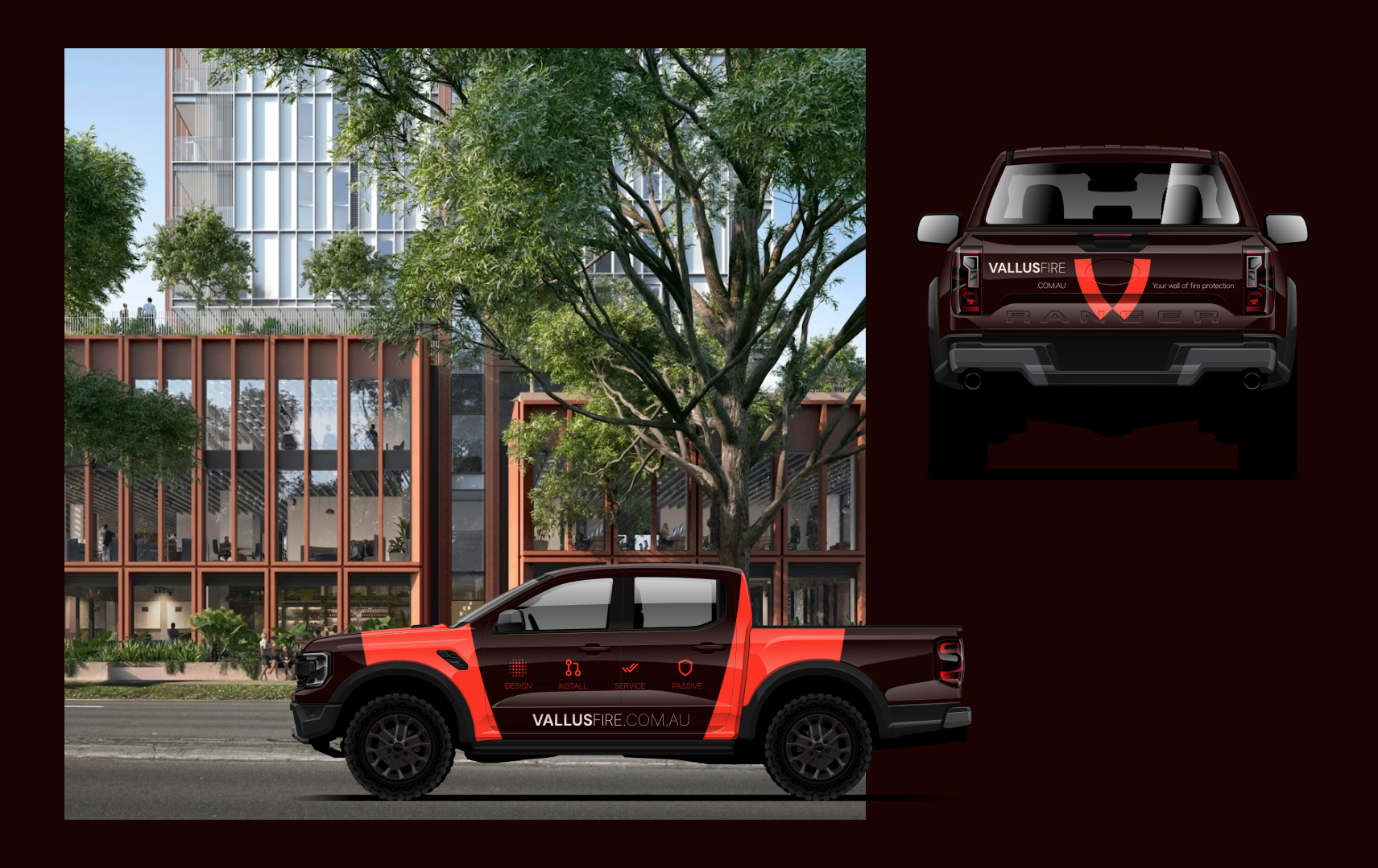
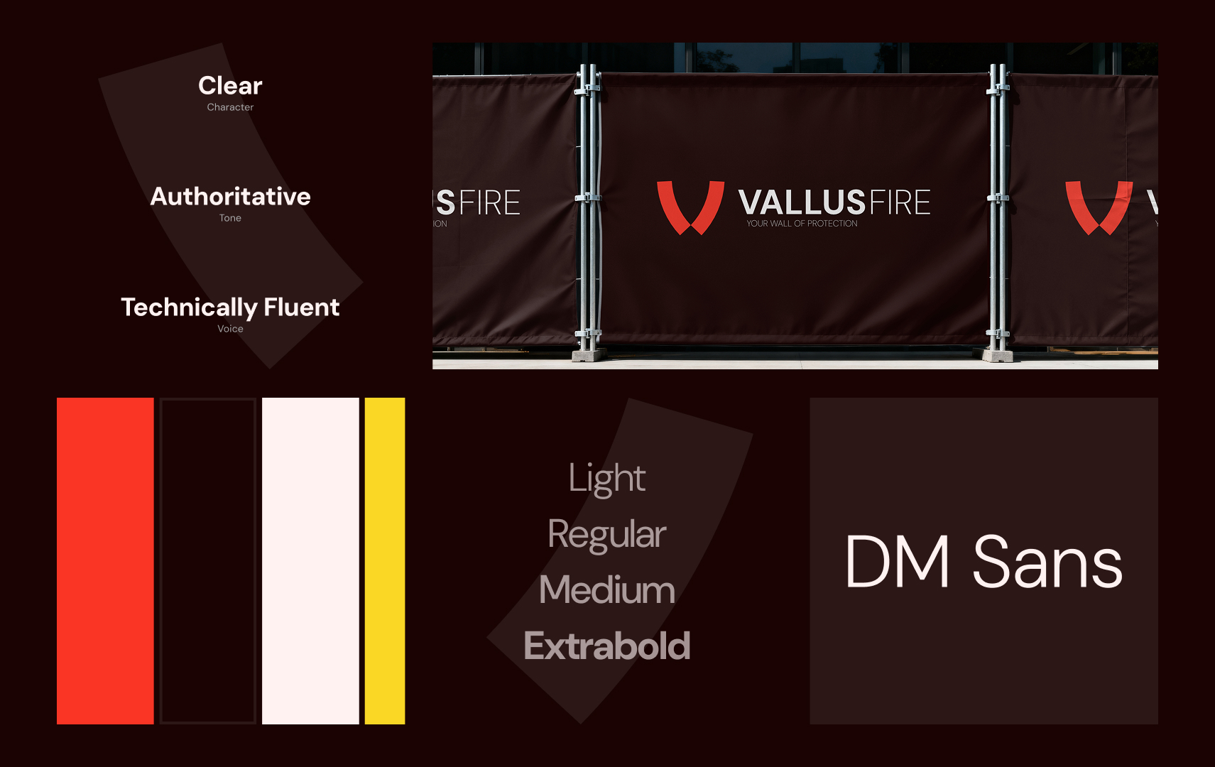
Across the sector, brand messaging and capability signals are overwhelmingly focused on delivery scale, compliance routines, and long-term maintenance. Due to how the industry functions, most brands are abnormally safe, and there's little permission to "stand out".
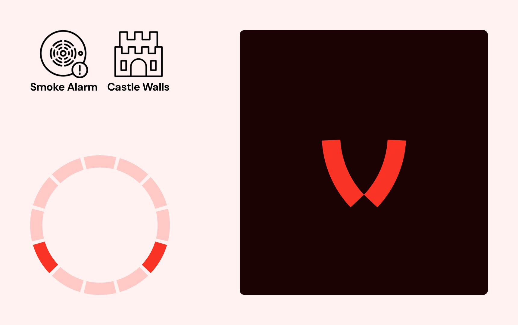
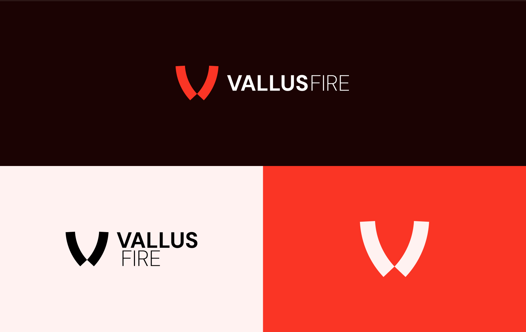
In a skeptical industry where "standing out" primarily loses trust, we couldn't go past red for the primary brand. Bringing the dark red up the hierarchy allowed us to create a safe and trusted brand with a hint of modern. The icon is derived from core components of the service, and sit to shape the base of a flame.