A brand and digital presence for premium new Batemans Bay residences. The identity had to own a sophisticated, yet natural niche in the NSW South Coast property market
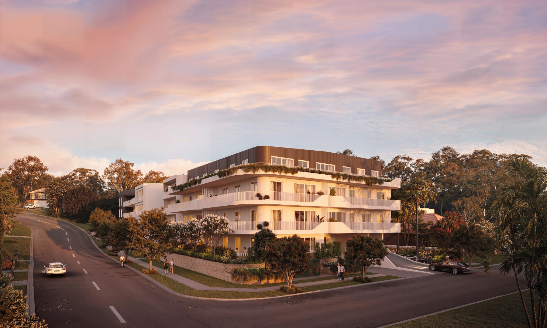
The Paloma is a three-building, golf-side, water-view residential project in Batemans Bay created to introduce a new level of refined, resort-inspired living to the region. The brand must express calm, curation, and lifestyle uplift through amenity (pool, gym, communal spaces) while balancing two core markets; refined sophistication and attainable aspiration.
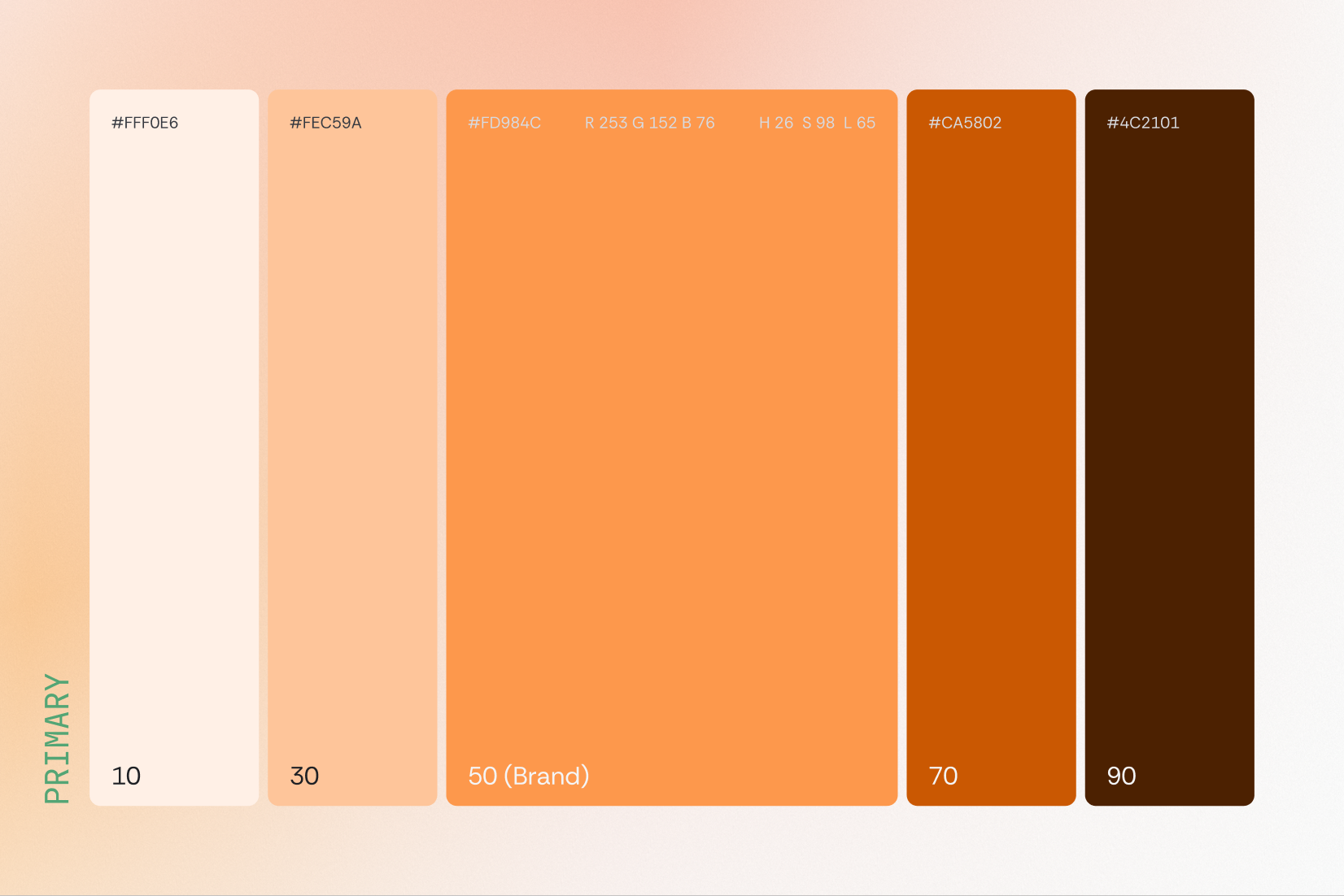
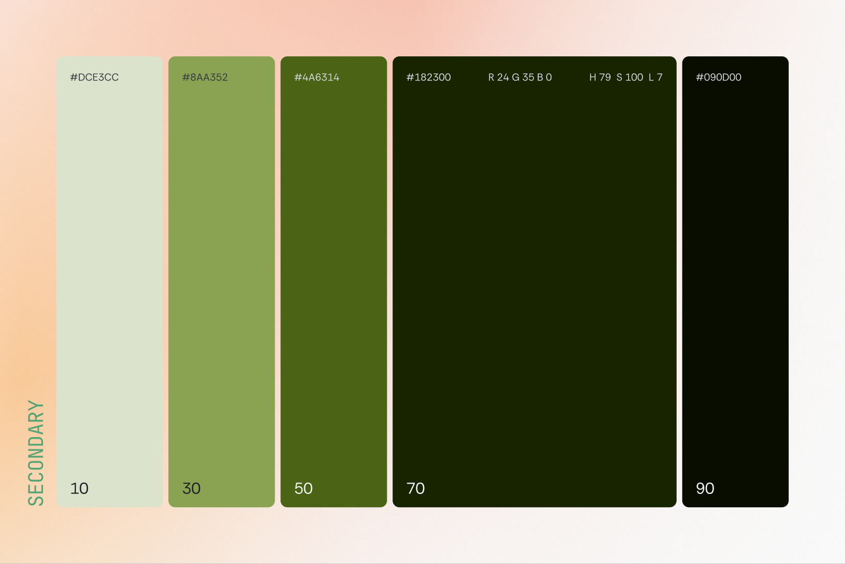
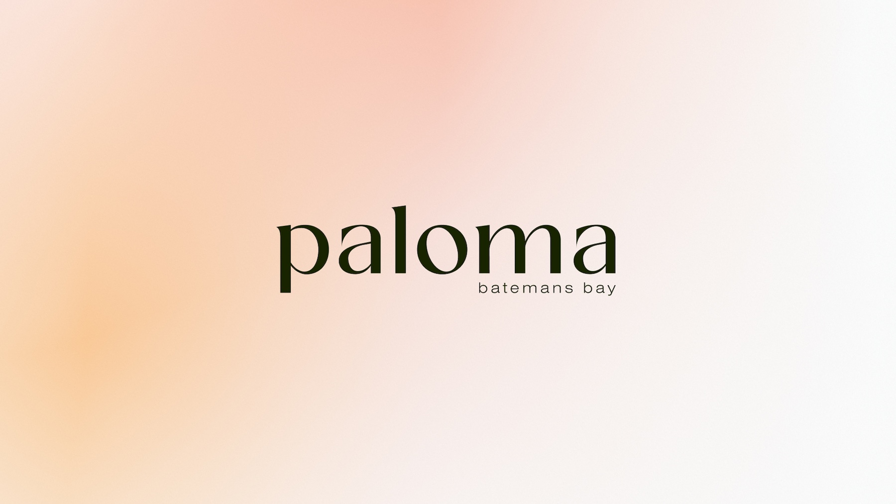
The Paloma cocktail naturally provides a useful colour palette anchor. These tones blend seamlessly into a resort-inspired visual world and give the brand a subtle, built-in naming-to-colour logic.

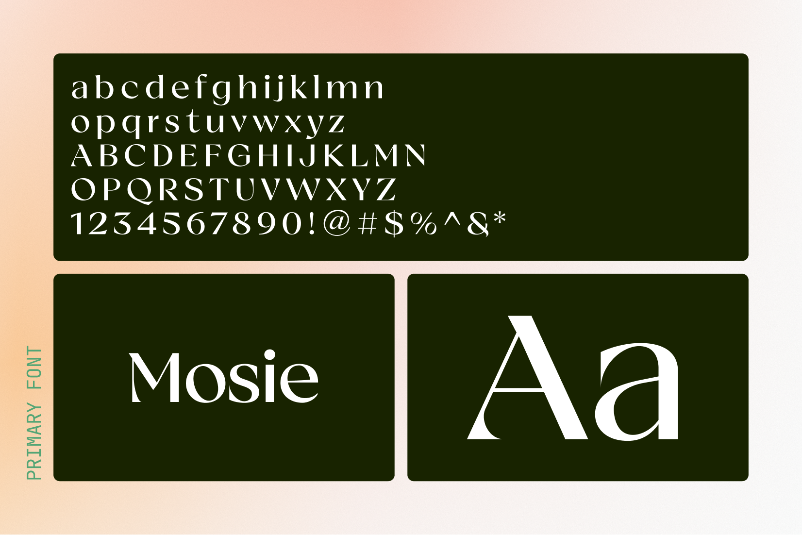
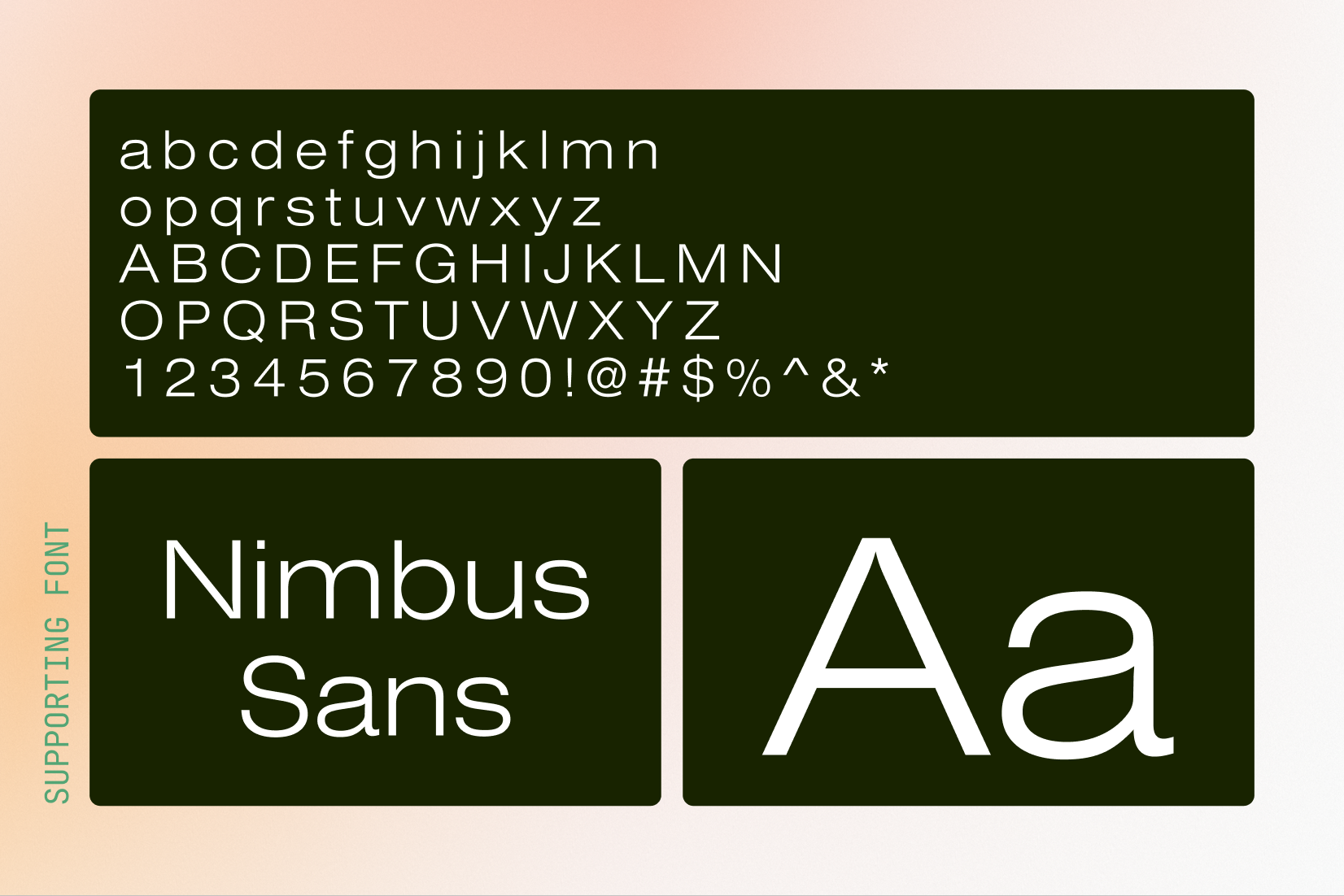
Created a visual identity that was refined, yet approachable to thread the needle in the market. The warm, coastal Paloma orange is accompanied by a jungle green to spark a sense of curiosity. Mosie added attainable sophistication through typography, supported by Nimbus Sans to give the visual identity some breathability.